1. Sell the experience visually, not with text.
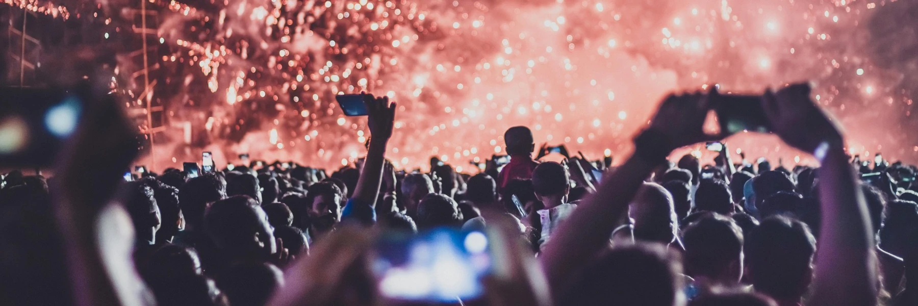
Experiences in 2026 are sold through visuals, not paragraphs of copy. The first thing a visitor should see is what it actually feels like to be there. A gallery of photos and videos from past events communicates more in three seconds than any description can.
Video is particularly powerful. Auto-playing video on page load immediately pulls visitors into the atmosphere of the event before they have even scrolled. It is one of the most effective ways to create desire and reduce hesitation. If you have footage of the crowd, the production, or the energy of a previous event, use it.
On yourkind, event pages include a media gallery that sits right below the key event info and ticket button, so visitors see the visuals before they read a single line of description. Videos auto-play on page load. You can also add photos and videos to individual add-ons to help sell upgrades and extras visually.
2. Let social proof and urgency do the selling.
Social proof and scarcity signals are some of the most effective conversion tools available. Research shows that combining social proof with scarcity cues can improve conversion rates by 25 to 45 percent. 60 percent of people who experience FOMO make a purchase within 24 hours.
The key is that these signals need to be real. A “Selling Fast” tag that reflects actual sales data creates genuine urgency. A fake countdown timer that resets every day destroys trust. Modern audiences are sophisticated enough to spot manufactured scarcity, and the reputational cost is not worth the short-term lift.
yourkind automatically adds urgency and social proof tags to ticket types based on real sales data. Things like “Selling Fast” and “10 tickets left” appear on your page without you having to do anything. Honest, automated, and proven to drive FOMO.
3. Remove every friction point from checkout.
Every additional step between “I want to go” and “I have a ticket” costs you sales. One of the biggest offenders is requiring account creation before checkout. Research shows that 24 percent of people abandon a purchase entirely when asked to create an account.
On mobile, where the majority of event ticket purchases now happen, friction is even more costly. Mobile cart abandonment rates sit around 79 percent compared to 68 percent on desktop. Slow load times, clunky forms, and unnecessary steps all compound the problem.
yourkind does not require account creation to complete a purchase. The checkout is optimised for mobile, supports Apple Pay and Google Pay, and is designed to get someone from event page to confirmed ticket in as few taps as possible.
4. Design for mobile first.
Over 60 percent of event ticket purchases now happen on a mobile device, often within minutes of someone seeing a post in their feed. Yet most event pages are designed on desktop and never properly tested at phone screen size. The result is cut-off images, tiny buttons, and ticket panels that do not scroll properly.
If your event page does not look and feel seamless on a phone, you are losing sales. Check that images crop correctly, the ticket button is easy to tap, and the full purchase flow works smoothly in portrait mode. These are not nice-to-haves. They directly determine whether someone who taps through from an Instagram story buys a ticket or bounces.
yourkind event pages are built mobile-first. Every page is responsive, optimised for portrait mode, and designed so that the path from page load to purchase is seamless on any device.
5. Stay on brand without compromising conversion.
Your event page should feel like your brand, not a generic ticketing template. But full creative control can be a double-edged sword. Organisers who redesign their pages from scratch often unknowingly break the layout patterns that actually drive conversions, like CTA placement, visual hierarchy, and information flow.
The best approach is structured customisation: the ability to match your brand's look and feel (colours, accent colours, imagery) within a page structure that has been tested and optimised to convert.
yourkind gives you control over your colour scheme, accent colours, and visual branding while keeping the underlying page structure intact. Your pages look and feel like yours, but the conversion architecture stays in place. No compromising one for the other.