yourkind brand guidelines
01 / The idea
Built for the people who make it happen.
yourkind is for the people who turn ideas into experiences.
The creators, organisers and communities who bring people together, make things happen and give people something to remember. Our identity reflects that same ambition: confident, expressive and unmistakably human.
Complement, don't compete.
The visual identity is designed to complement the experiences it represents, not compete with them.
Grounded.
A considered foundation of warm neutrals and deep ink keeps things grounded.
Energetic.
Vibrant colour brings energy and personality.
Purposeful.
Every element has a purpose, creating an identity that's distinctive, flexible and recognisably yourkind.
02 / Colour
Colour with a job to do.
Lime gets attention. Feijoa keeps us grounded. Kind brings clarity. Paper and Ink set the foundation, with gradients adding an occasional touch of expression.
The spark of the brand. It stands for energy and momentum, so we save it for the moments that deserve attention.
Our deepest green. It carries type on Lime and Zest, where Feijoa is too light to read.
Our grounded green. It carries the Slate on light backgrounds and steps in when a gradient is not practical.
Clarity and trust. A calm, confident blue for when lime would be too loud.
Warmer than white and easier on the eyes. This is where most light layouts begin.
Our everyday dark. Use it for type, dark fields, and the quiet space around brighter colour.
Zest
#d4ff70 → #c8ff2a
Bright, energetic and unmistakable. Our boldest expression of colour, designed to make an impact.
Fig
#64b40f → #78cd19
Rich, grounded and versatile. A deeper green that brings balance to our brighter palette.
Cloud
#add7f5 → #74b7ed → #3f86dc
Light, open and expansive. A softer expression of colour that brings a sense of space and possibility.
03 / Type
Three typefaces.
One identity.
Poppins brings the personality. Geist adds clarity and balance. Geist Mono gives the finer details their own distinctive character.
More than a moment.
Poppins: Headlines
The people, places and experiences that stay with us.
Geist: Body copy
PEOPLE / PLACES / EXPERIENCES
Geist Mono: Details
04 / Logo
Lead with the name.
Our wordmark is the primary expression of our identity. When space is limited, the Slate provides a simpler, recognisable alternative.
One word. Always lowercase.
yourkind is always written as one word, in lowercase. It's a name that reflects what we're about: bringing people together through shared experiences.
yourkind.
The wordmark comes first.
Our full logo should always take priority. Use the Slate on its own for smaller applications, where the full wordmark isn't practical.
Choose the right contrast.
Choose the version labelled Dark backgrounds when placing on Ink or a photo. Choose Light backgrounds on Paper, white, or any pale surface. Always pick the variation that keeps the mark clear and recognisable.
Give it room.
Always leave enough clear space around our logo to let it stand on its own. Keep surrounding text, imagery and other elements at least one Slate-height away.
05 / In use
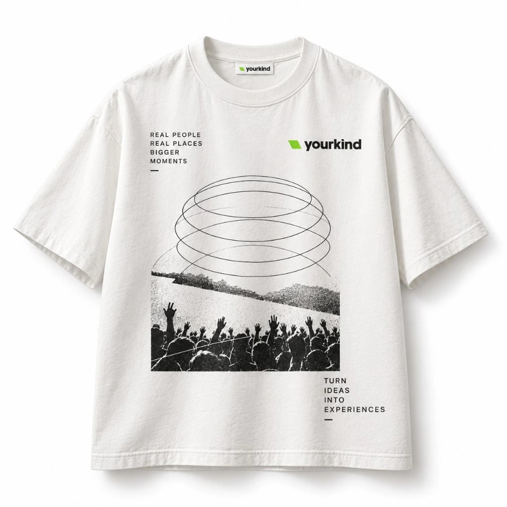
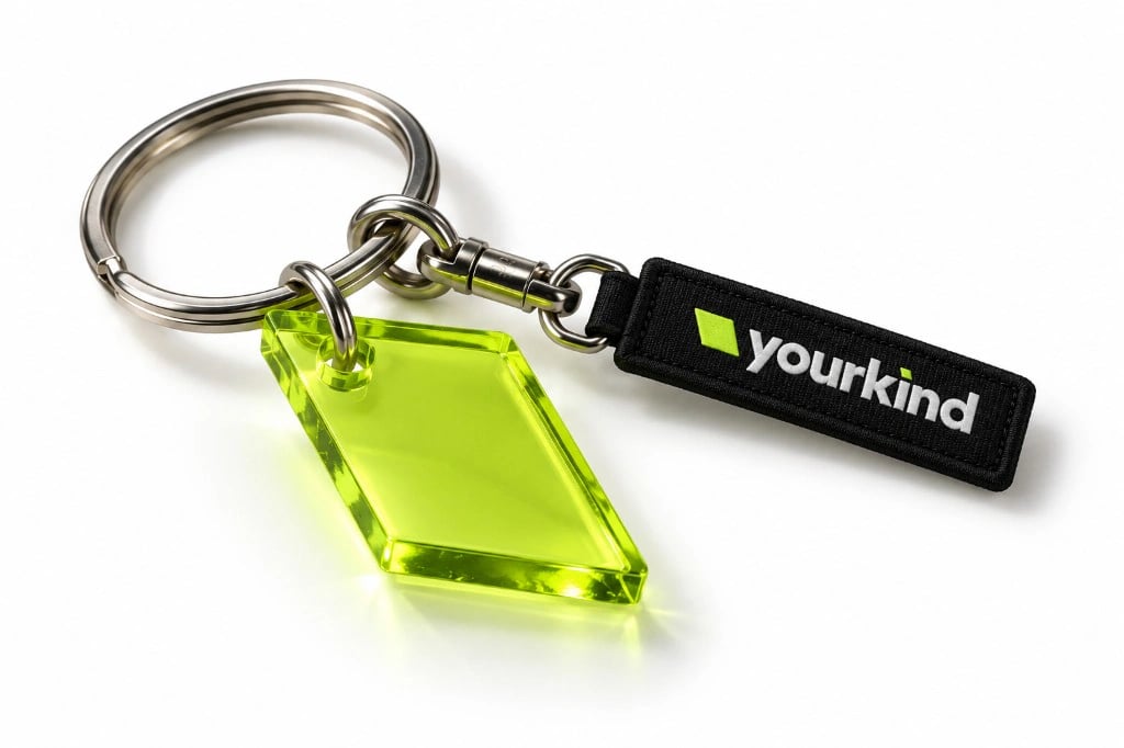
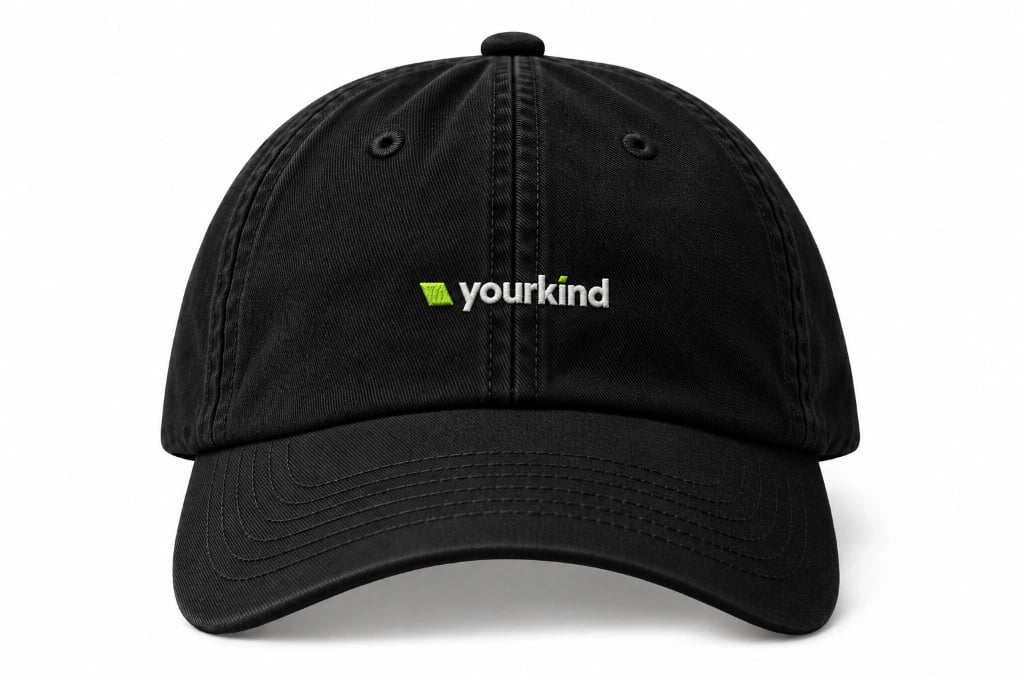
Made for the things people keep.
06 / Resources
Take what you need.
The wordmark, for when the name says it all.
Dark backgrounds
Full colour, for ink, photography, and deeper backgrounds.
Light backgrounds
Full colour, for white, paper, and pale backgrounds.
Mono black
One colour, for print, foil, embossing, and stamps.
Mono white
One colour, for dark grounds, photography, foil, and embossing.




The Slate, for smaller spaces.
Dark
Full colour, for dark app icons and avatars.
Light
Full colour, for light app icons and avatars.
Mono black
One colour, for print, foil, and embossing on light grounds.
Mono white
One colour, for dark grounds, photography, and reversed-out jobs.